Chompers & Whiskits
(Packaging Design, Identity Design).
Chompers & Whiskits is a playful rebrand of Trader Joe’s pet line, bringing more joy and personality to treats and toys for cats and dogs. With the pet industry rapidly expanding. Especially in premium products that strengthen pet owner bonds; Trader Joe’s has a major opportunity their current pet section hasn’t capitalized on.
This project fills that gap with irresistible, character driven packaging inspired by the humor, warmth, and storytelling that Trader Joe’s shoppers will love. The designs feel expressive and fun, turning pet products into items you’d happily throw in your cart.


Each product serves a specific audience:
– Treats for adult cats and dogs
– Treats for kittens and puppies
– Toys designed for each pet’s play style
– A packaging “back trick” for dogs and cats that adds an interactive moment
By treating every package as its own playful character, this line invites shoppers to engage with the product emotionally, not just functionally. Designing this project taught me how to connect brand strategy with consumer behavior, identifying a market gap, studying industry trends, and building a system that’s both visually expressive and strategically grounded.
01: Logomark

The new logo modernizes Trader Joe’s in a way that feels soft, friendly, and handcrafted. The original mark is charming but increasingly outdated and hard to read, especially for a younger audience. My redesigned version still respects TJ’s tradition but introduces a more malleable, character driven style; the kind you see across their unique, product specific labels. It reflects the fun, joy, and quirkiness pets bring into our lives.
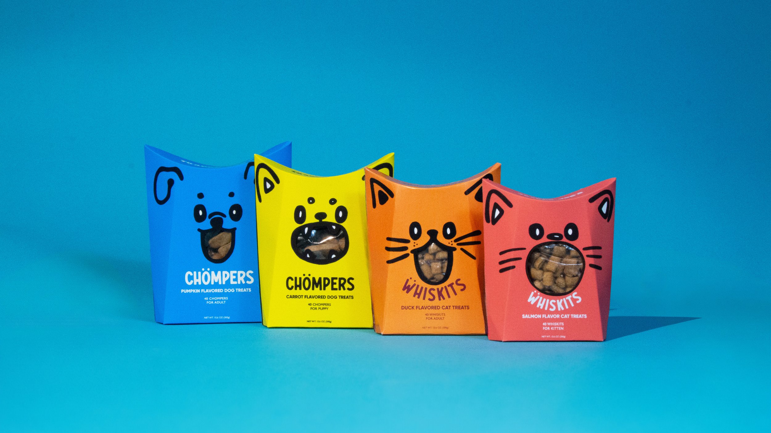
02: Packaging Concept


The packaging unfolds from the top for easy access to treats, while the toy features a handle and reveals a surprise inside. Made from eco friendly materials, it’s a sustainable alternative.
03: Activation
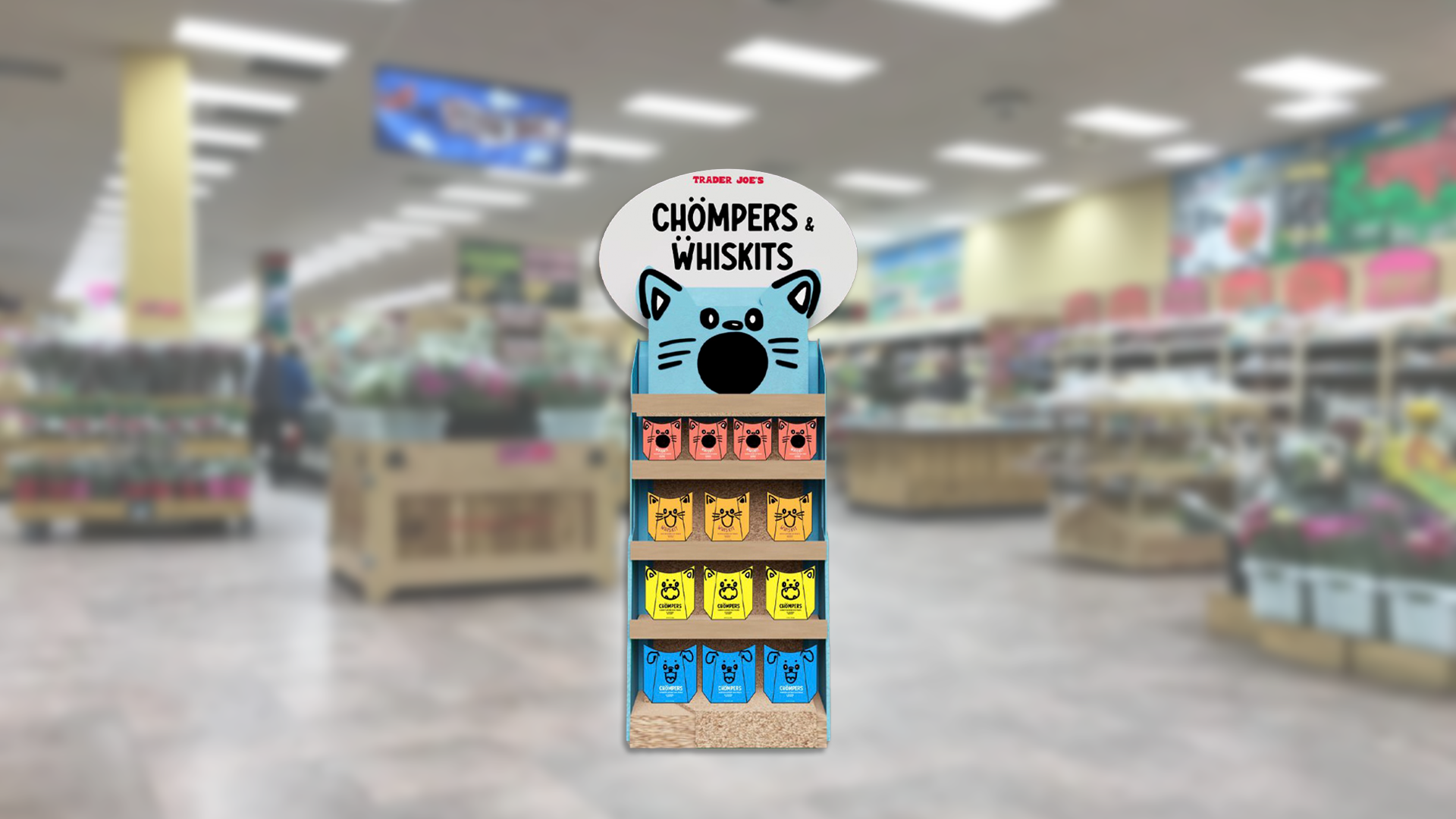

The end cap display creates an eye catching in store moment, while the delivery truck carries the brand into the world as a bold, playful moving billboard.
04: Advertising


05: Poster Activation


06: Staff ID

As part of the activation to promote the new product, staff will wear fun nametags introducing themselves and their pets, adding a personal and playful touch to the experience.
07: Web Design


08: Fearless Flyer


I created a custom Trader Joe’s Fearless Flyer just for Chompers and Whiskits, featuring hand drawn elements that reappear throughout the design to promote the new product.
09: Graphic Application
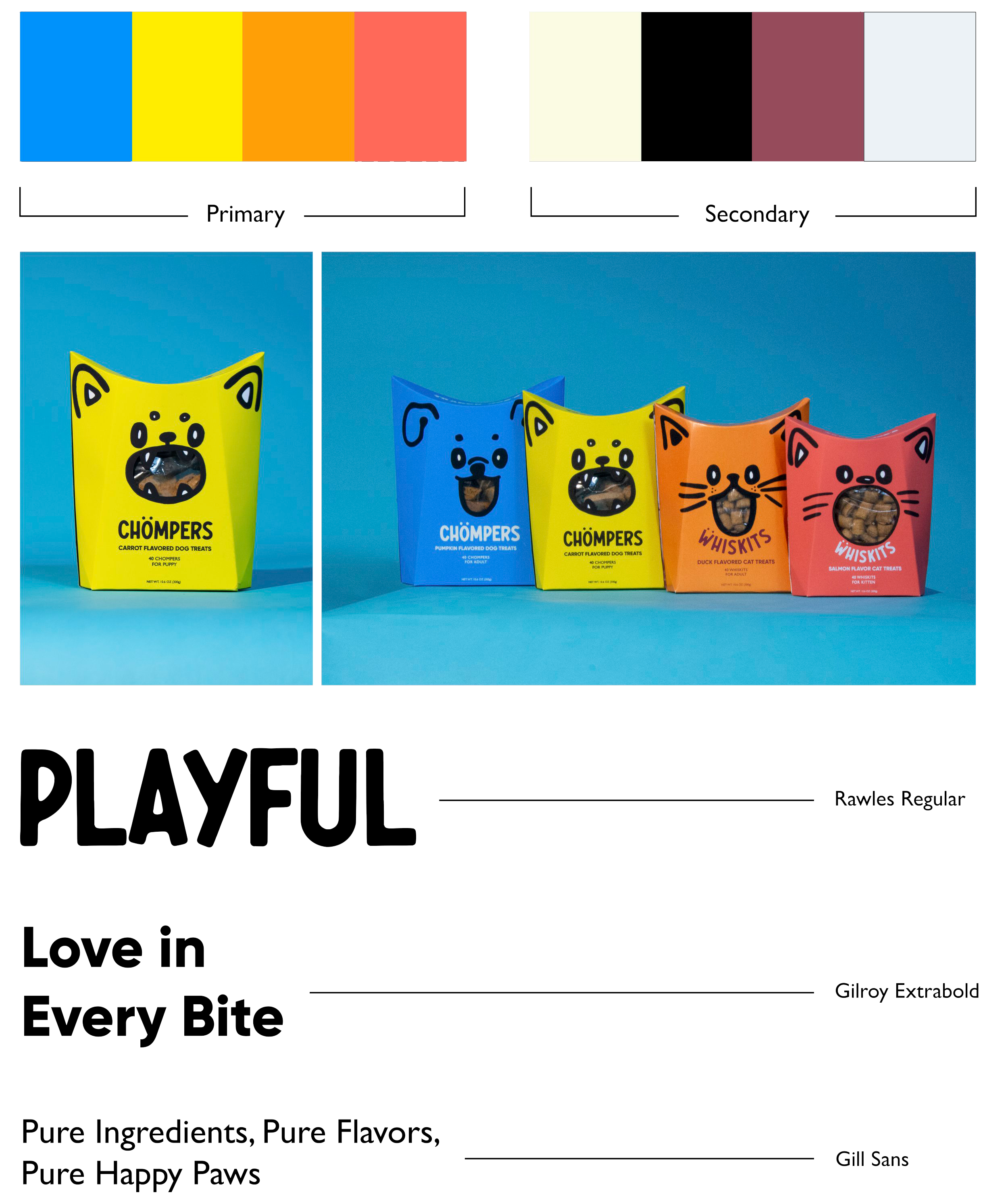
The color palette for this project was carefully chosen to break away from generic, washed out tones and embrace bold, energetic colors that stand out. Inspired by the vibrancy often seen in toy brands.
Chompers™ and Whiskits™ come in two sizes, tailored for adult and young pets, ensuring the perfect treat for every dog and cat.
The typography combines Rawles to match the packaging's monsterious, playful vibe and Gilroy for bold yet cute headers that grab attention. Gill Sans complements Gilroy perfectly, adding a clean, balanced touch to the overall design.
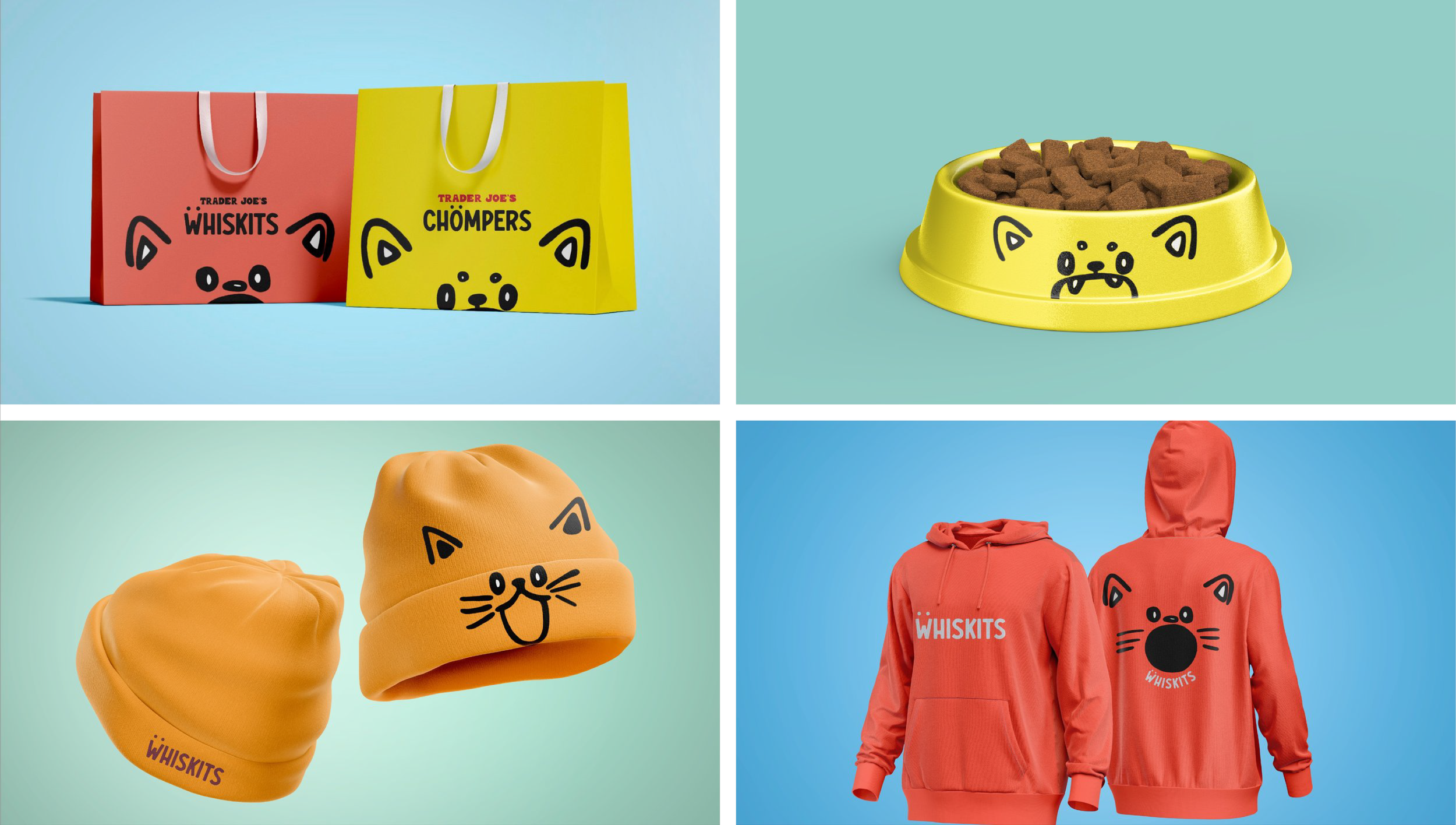
10: Merchandise