
Ice Hotel: Rebrand
(Hospitality Design, Identity Design)
Located in Jukkasjärvi, above the Arctic Circle, ICEHOTEL is the world's first hotel built from ice and snow. Recreated each winter with ice from the Torne River, it features artist designed suites, an Ice Bar, and Arctic adventures all in a stunning frozen landscape.


01. Why Rebrand?

To celebrate ice as art, honor Arctic and Sámi culture, and embrace impermanence through a sculptural identity rooted in nature, craft, and the northern light.
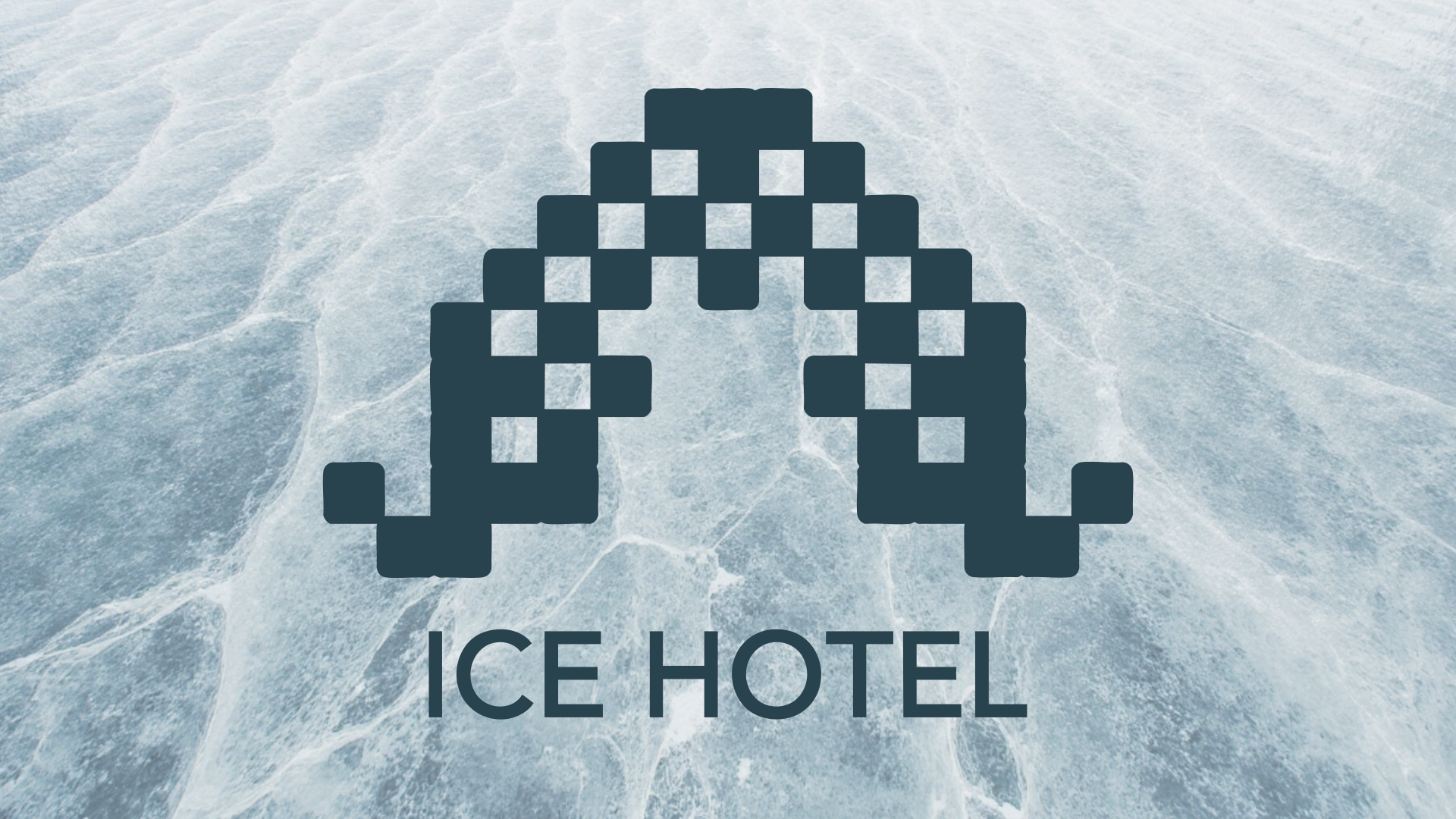
02. Logo

The logo sits at the front entrance, built from ice cubes adorned with Sami cultural patterns, glowing in a purple hue that evokes the Northern Lights while moving away from traditional blue.
03. Poster Series
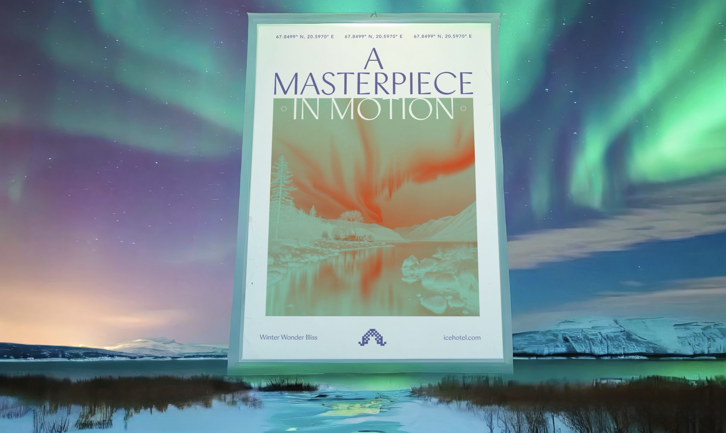


A splash of orange adds a celebratory touch, while the posters honor both the Northern Lights and the art of ice sculpting.
04. Look Book


07. Graphic Language
08. Website
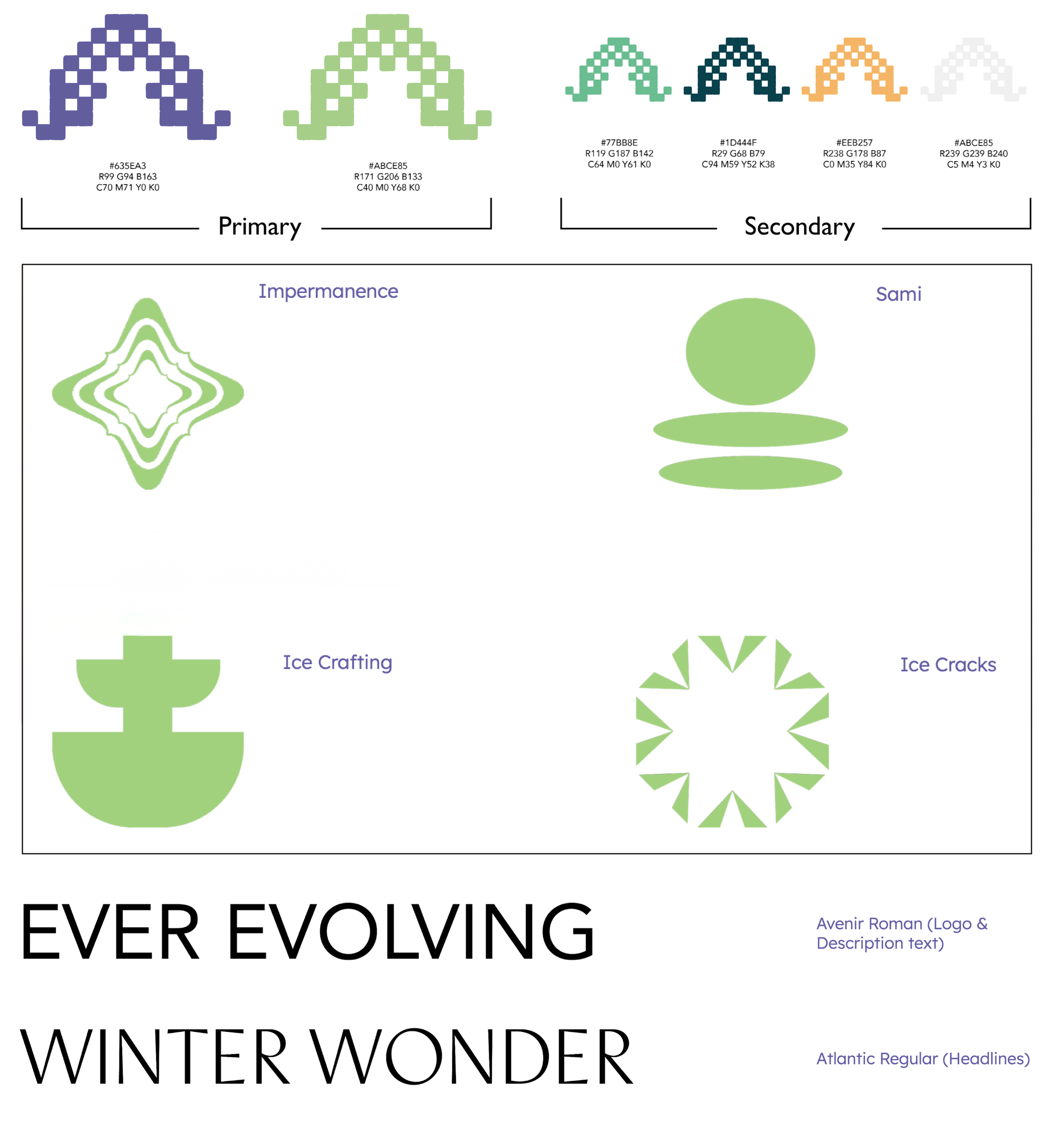
The color palette is inspired by snowy tones, moving away from traditional blues, with a splash of orange to symbolize celebration and green to reflect the glow of the Northern Lights.
The icon set features four elements: Sami cultural motifs, the impermanence of the Ice Hotel’s seasonal rebuild, the artistry of ice crafting, and abstract forms inspired by ice cracks.
The typography pairs Avenir Roman, bringing sophistication, with Atlantic Regular, which adds a winter-inspired, atmospheric feel.
05. Items
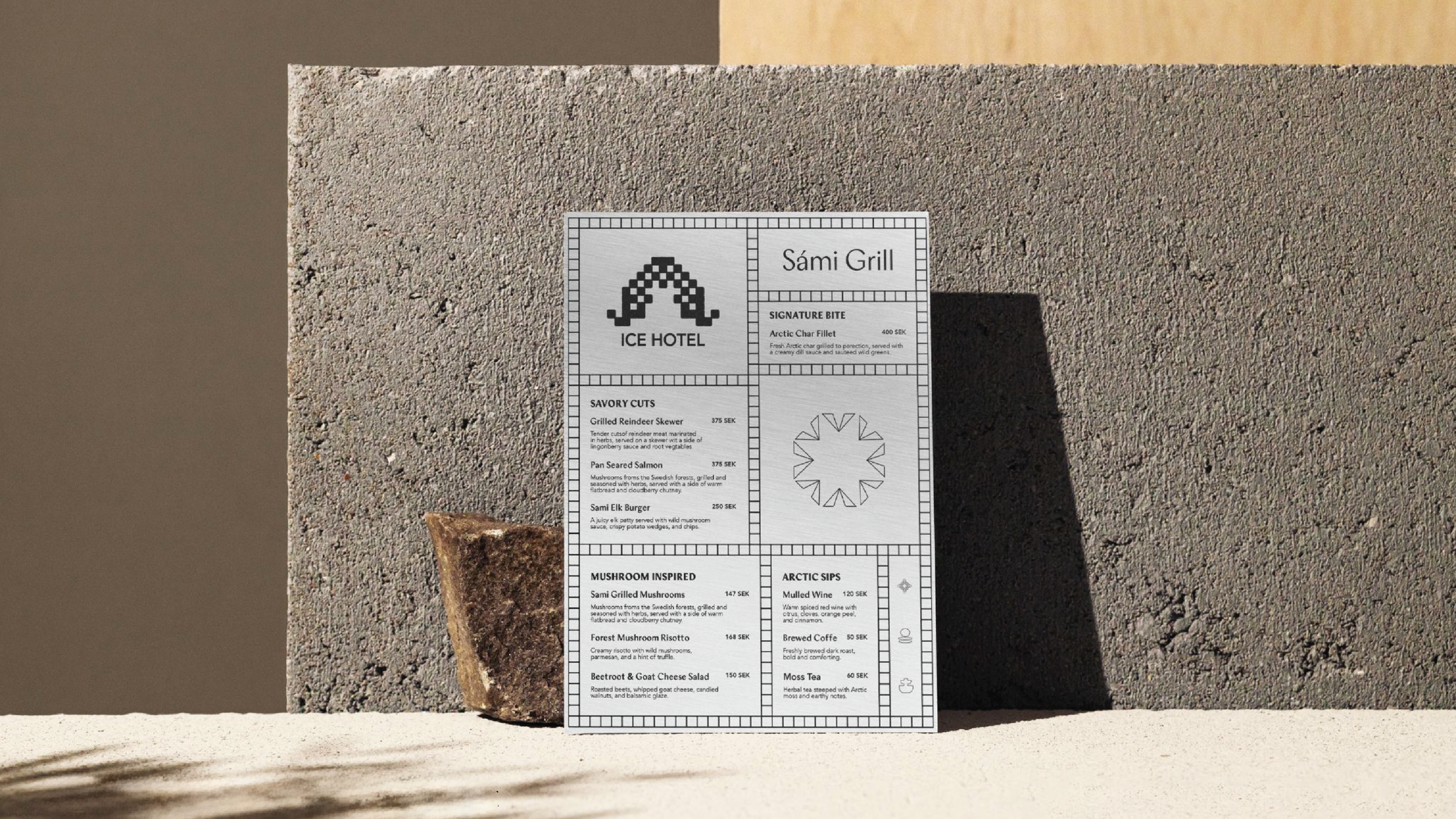
The Sami Grill takes inspiration from Sami and Nordic cuisine, featuring dishes such as elk, presented with a metallic finish. Complementing it is a water bottle designed in the shape of melting ice.

06. Spatial
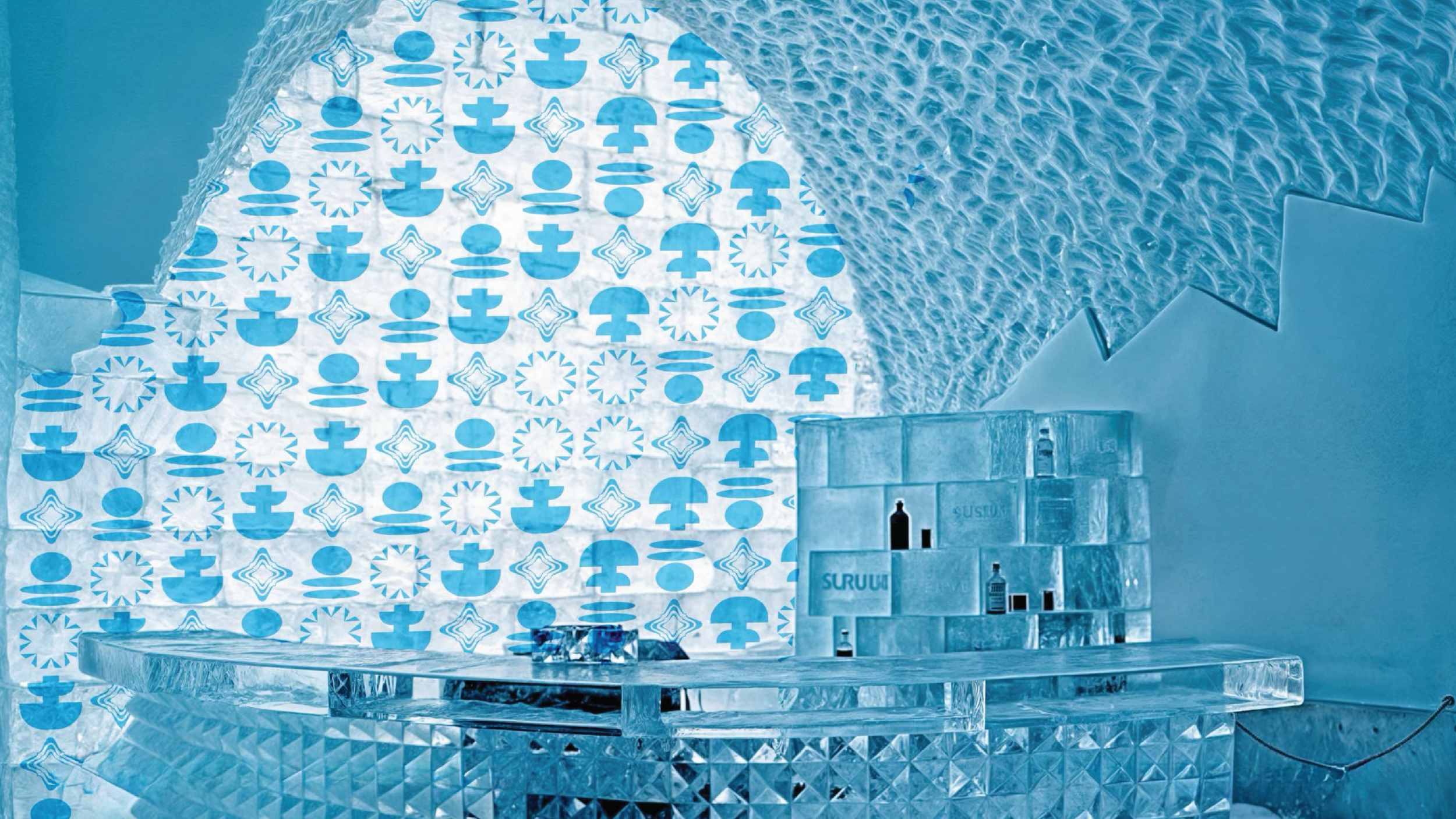
The new Ice Hotel features engraved ice patterns carved directly into the walls and rooms of the resort, creating an immersive, sculpted environment.
