Chompers & Whiskits
(Packaging Design, Identity Design).
Chompers and Whiskits focuses on creating playful, imaginative packaging for pet treats and toys. Inspired by the joy pets bring to our lives, this project celebrates the bond between pets and their owners through fun, vibrant designs that reflect quality and care while taking on a Trader Joe’s Rebrand.


01: Logomark

The new logo modernizes Trader Joe’s with a cuter, more playful design, with softer shapes, and a welcoming feel, enhancing its a charm and made for community connection.
02: Packaging Concept


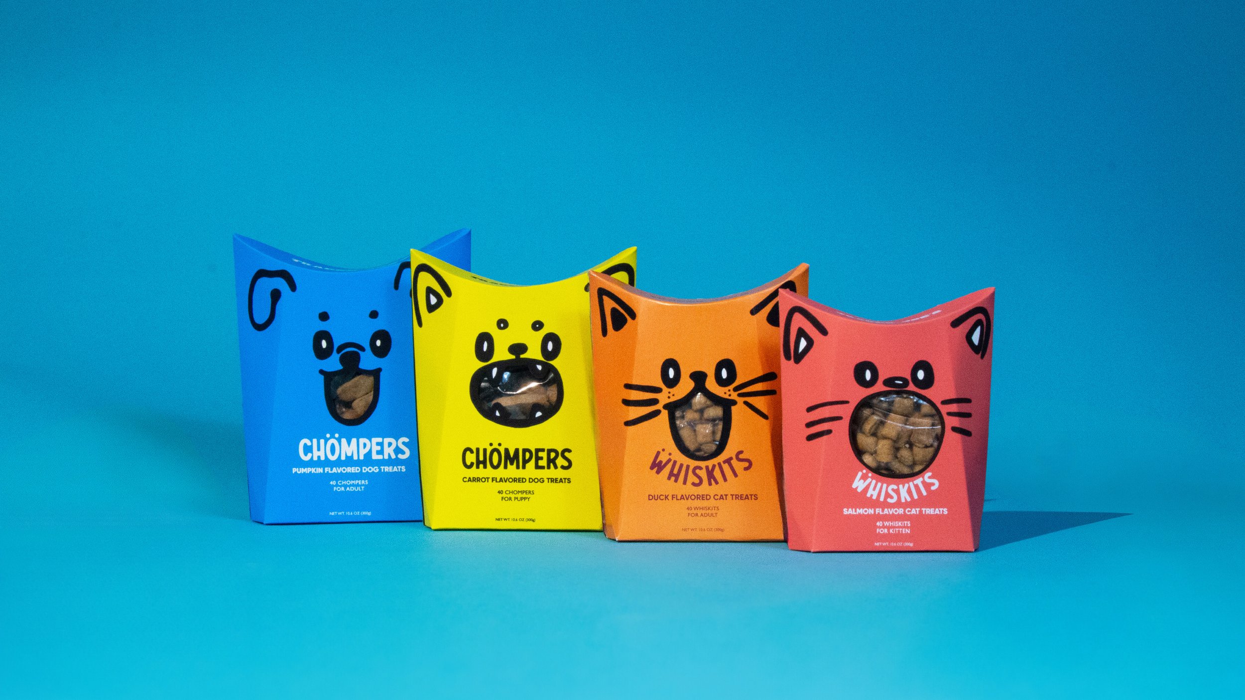
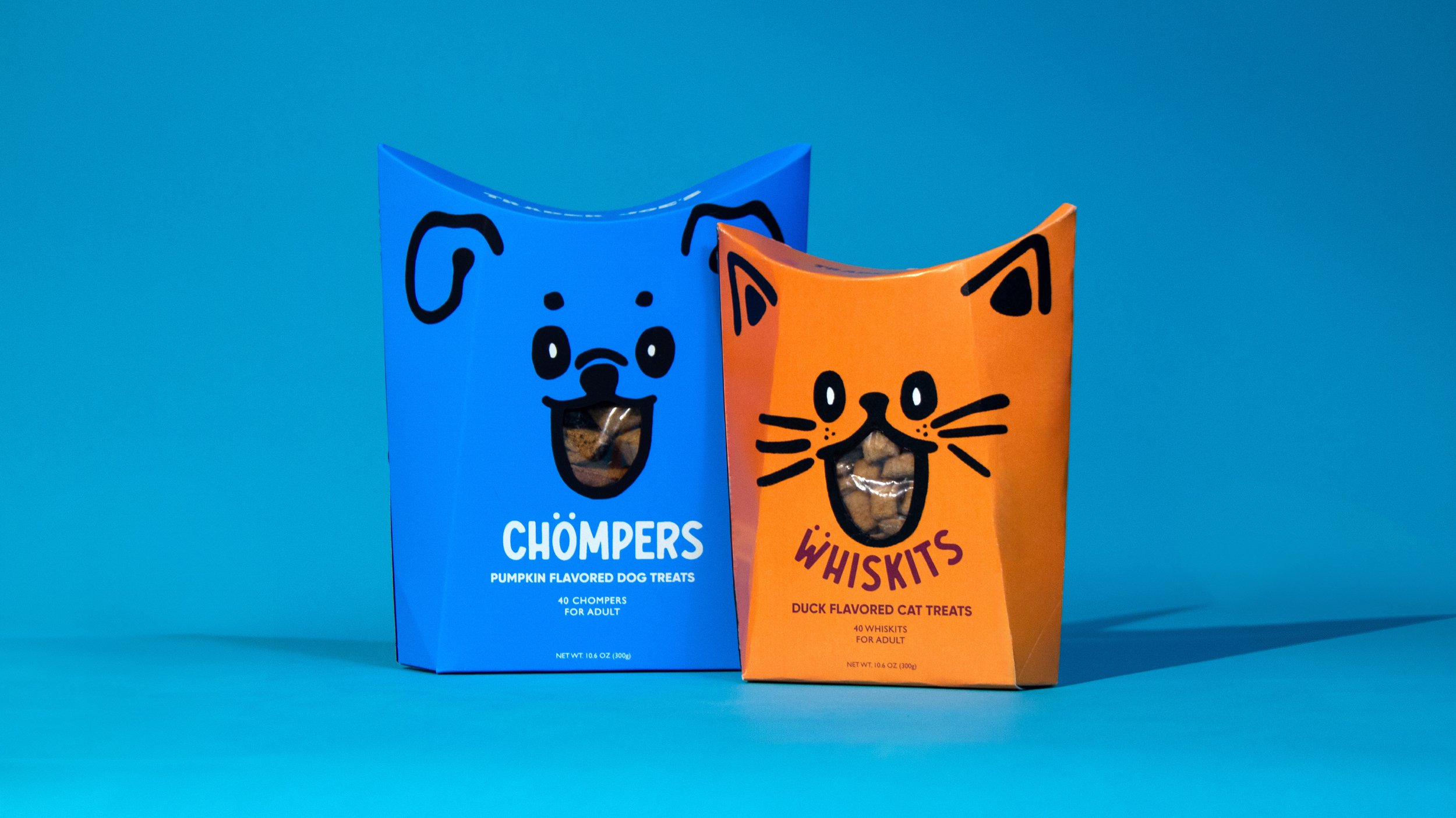
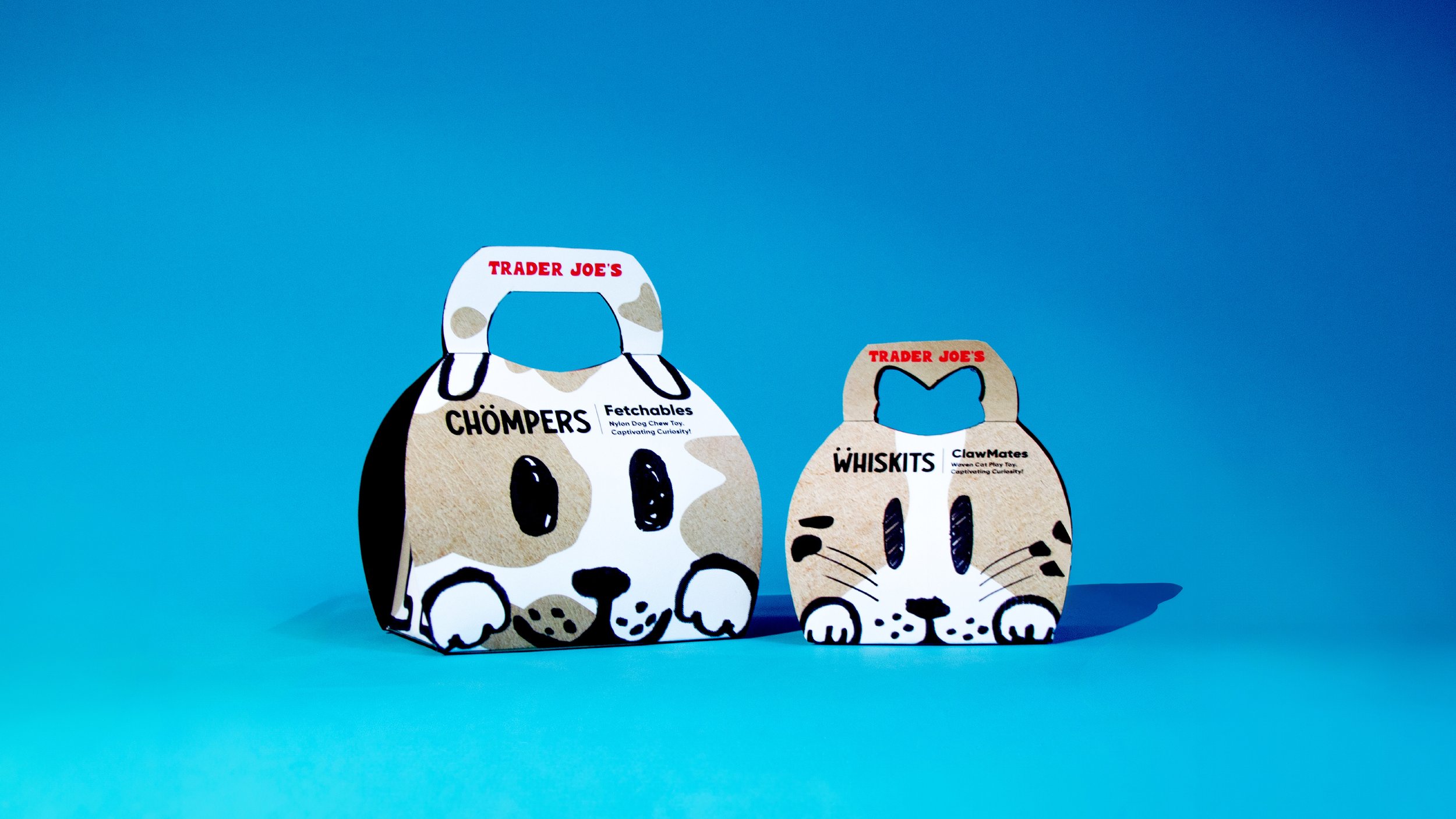
The packaging unfolds from the top for easy access to treats, while the toy features a handle and reveals a surprise inside. Made from eco friendly materials, it’s a sustainable alternative.
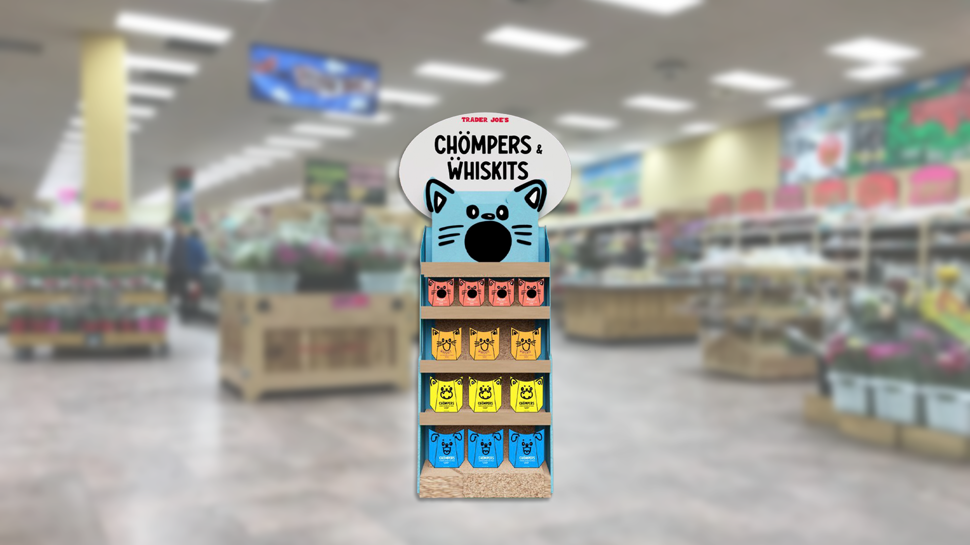
03: Activation

The new SoundCloud website brings a modern, experimental feel that inspires you to explore fresh genres, see what’s trending, and dive into the stories behind unique sounds.
04: Advertising


05: Poster Activation


06: Staff Id

As part of the activation to promote the new product, staff will wear fun nametags introducing themselves and their pets, adding a personal and playful touch to the experience.
07: Web Design


08: Fearless Flyer


I created a custom Trader Joe’s Fearless Flyer just for Chompers and Whiskits, featuring hand drawn elements that reappear throughout the design to promote the new product.
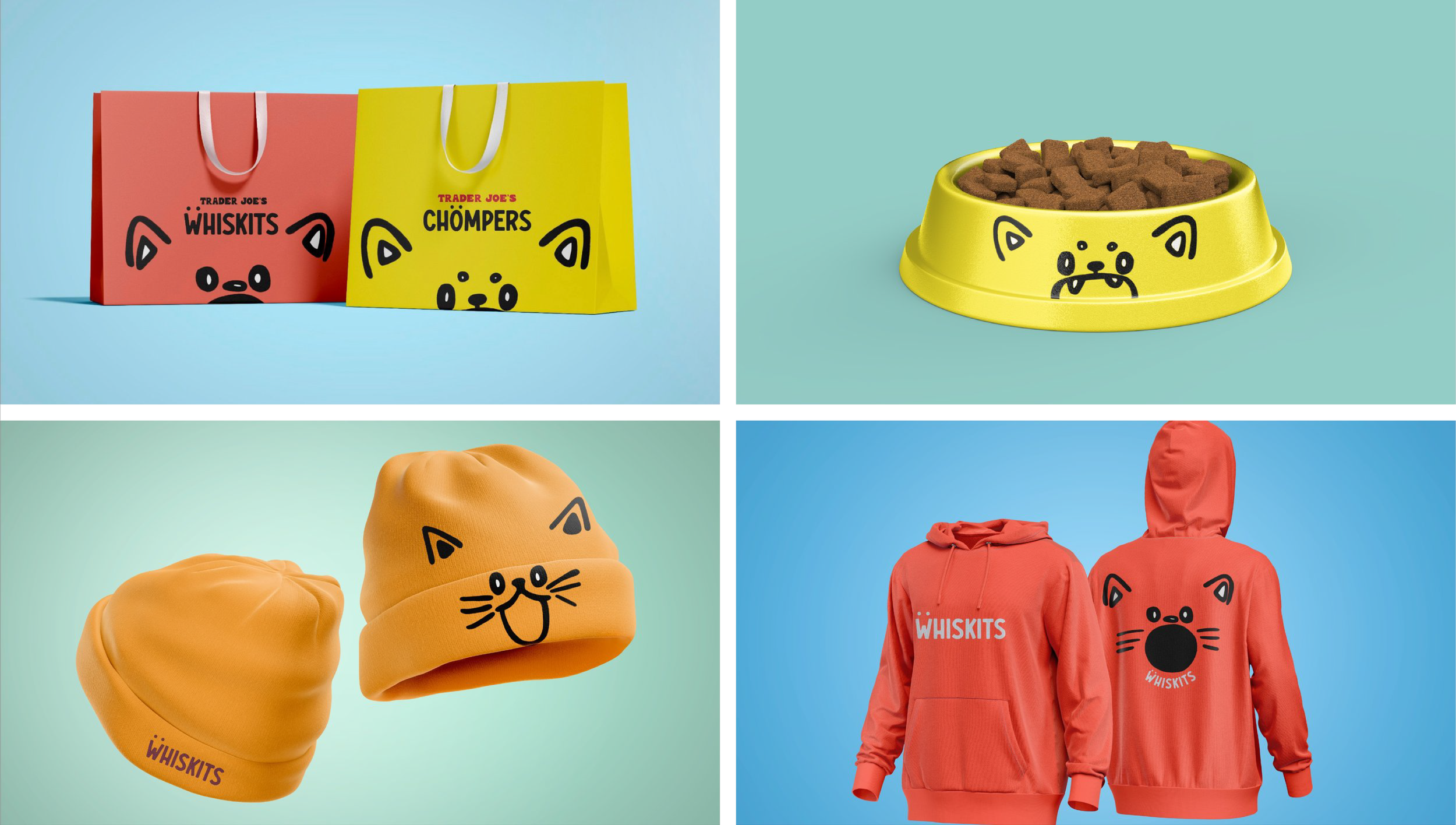
09: Graphic Application
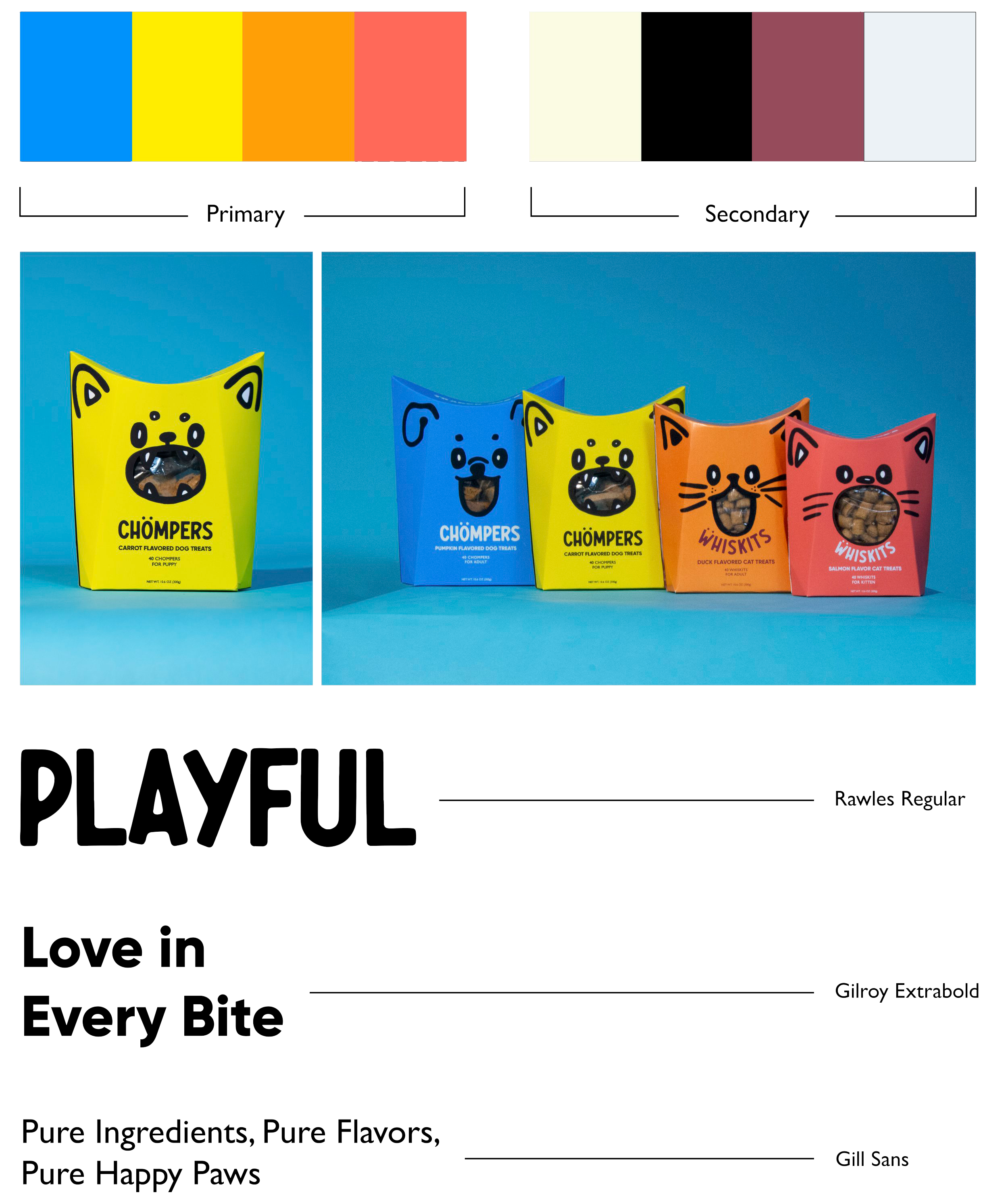
The color palette for this project was carefully chosen to break away from generic, washed out tones and embrace bold, energetic colors that stand out. Inspired by the vibrancy often seen in toy brands.
Chompers™ and Whiskits™ come in two sizes, tailored for adult and young pets, ensuring the perfect treat for every dog and cat.
The typography combines Rawles to match the packaging's monsterious, playful vibe and Gilroy for bold yet cute headers that grab attention. Gill Sans complements Gilroy perfectly, adding a clean, balanced touch to the overall design.